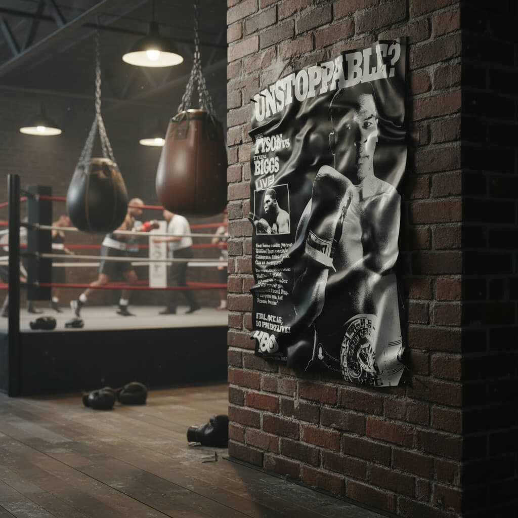
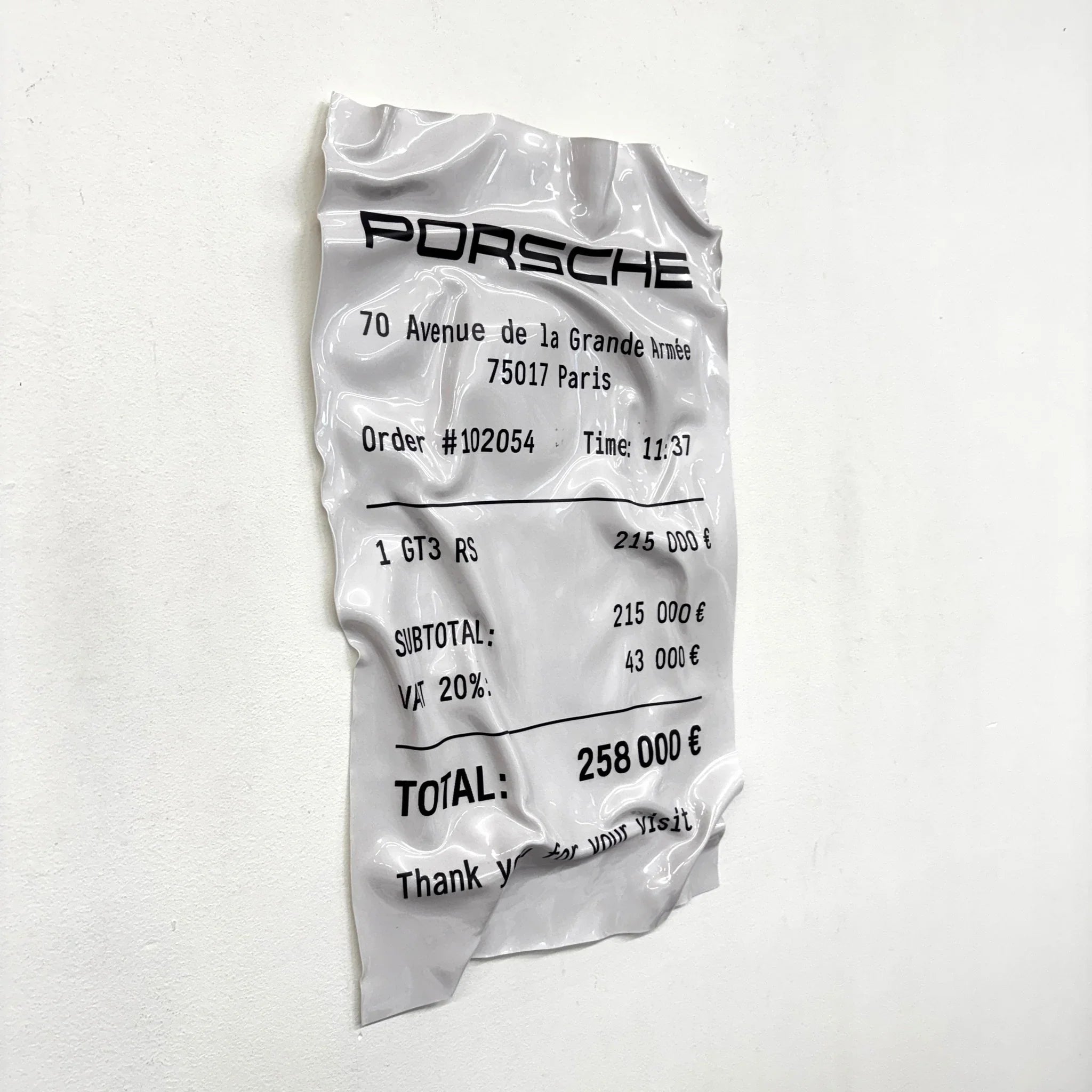
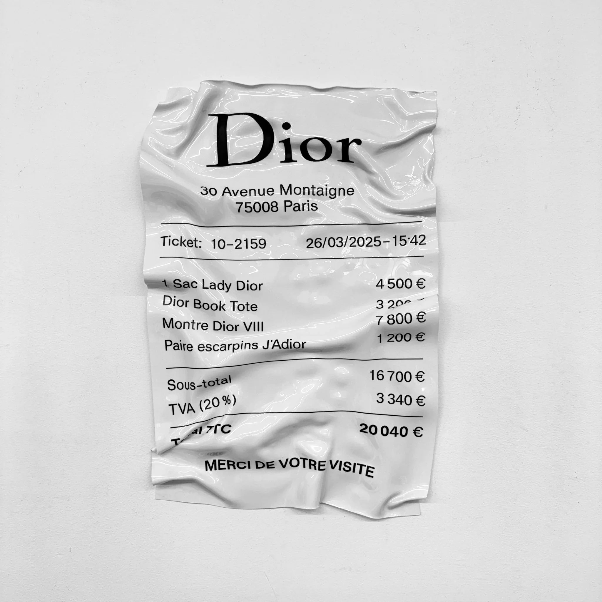
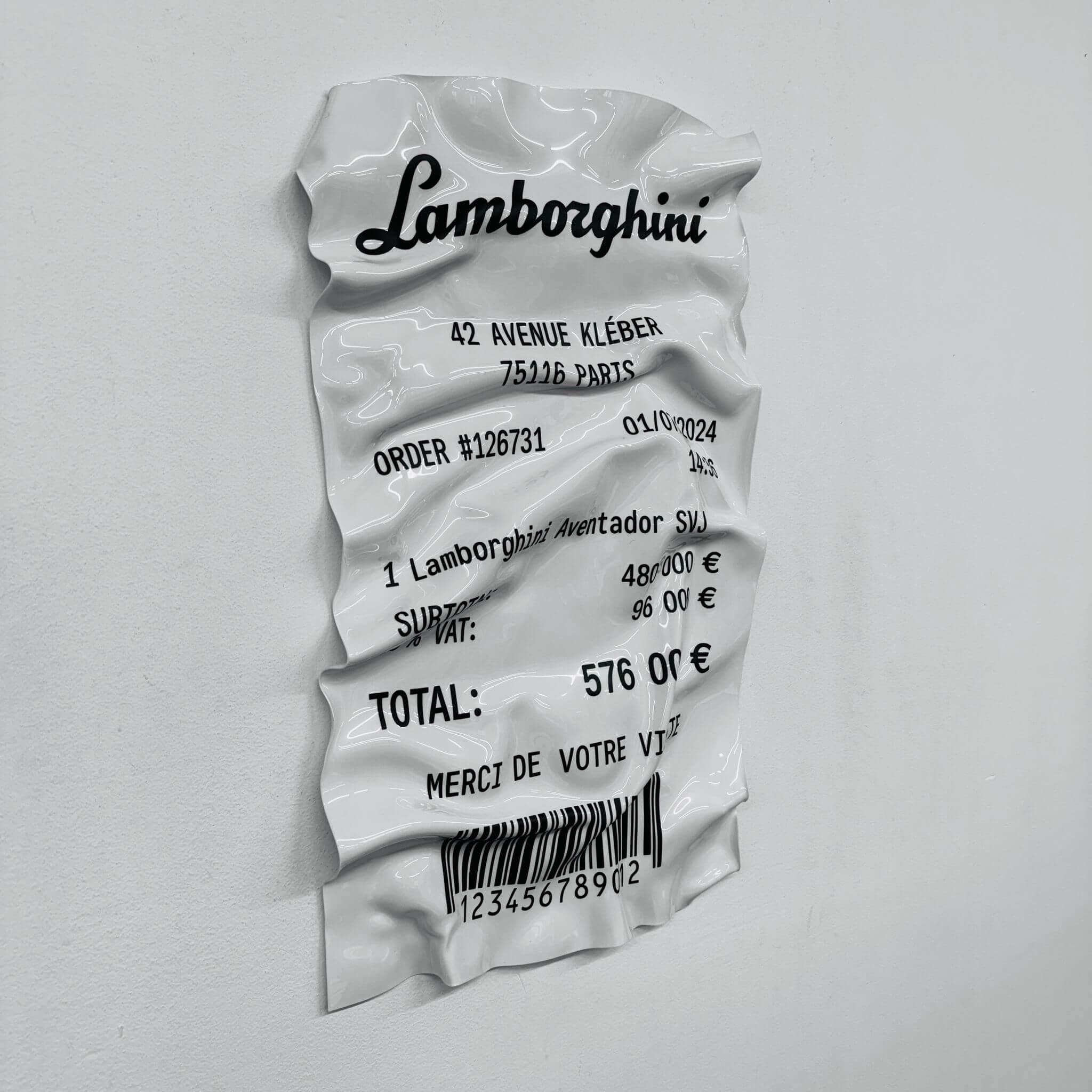
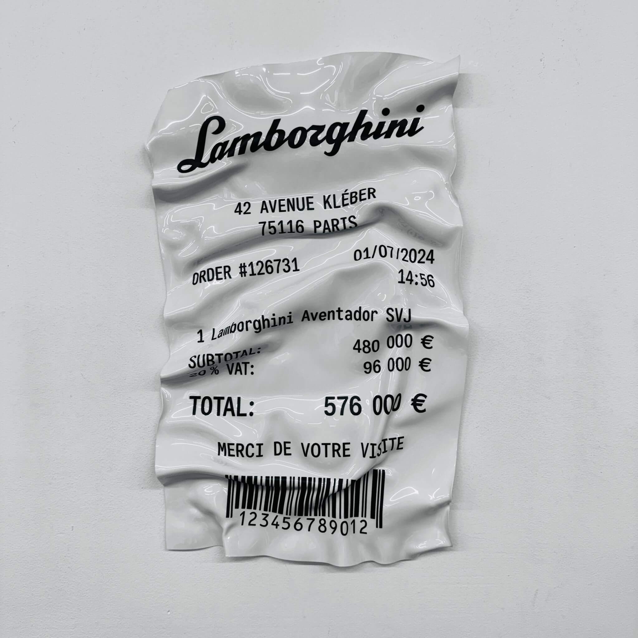
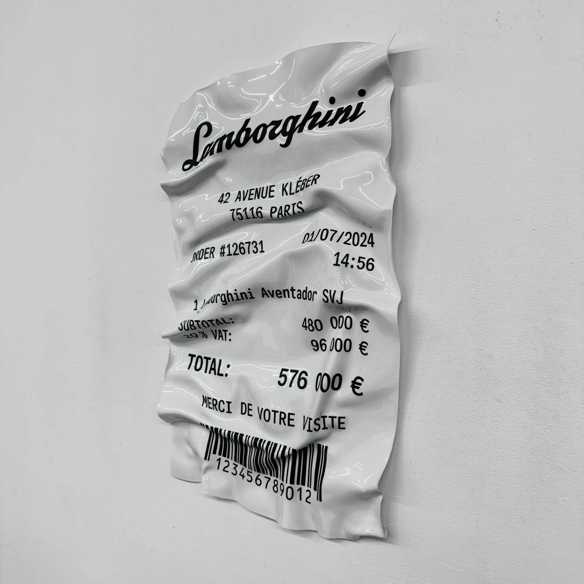
Crumpled Art and Minimalist Decoration: The Perfect Contrast
Minimalism is a design philosophy that celebrates simplicity, the absence of clutter, and purity. At first glance, adding Crumpled Art to a minimalist interior may seem paradoxical – after all, the texture and visual movement of Crumpled Art might appear to contrast with the clean lines of minimalism. But that is exactly where the beauty lies: a well-chosen Crumpled Art piece in a minimalist setting creates a beautiful balance between emptiness and form, simplicity and subtlety.

The Minimalist Philosophy Meets the Texture of Crumpled Art
Minimalism is not simply the absence of things. It is an intentional reflection on what to keep and what to discard. Every element must serve a purpose and contribute to overall harmony. In this context, Crumpled Art becomes a privileged focal point – a work that deserves the space it occupies precisely because it offers aesthetic and emotional value.
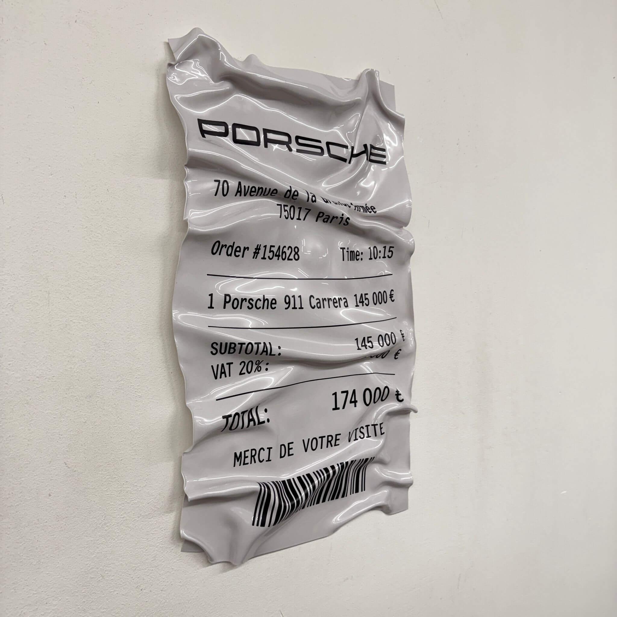
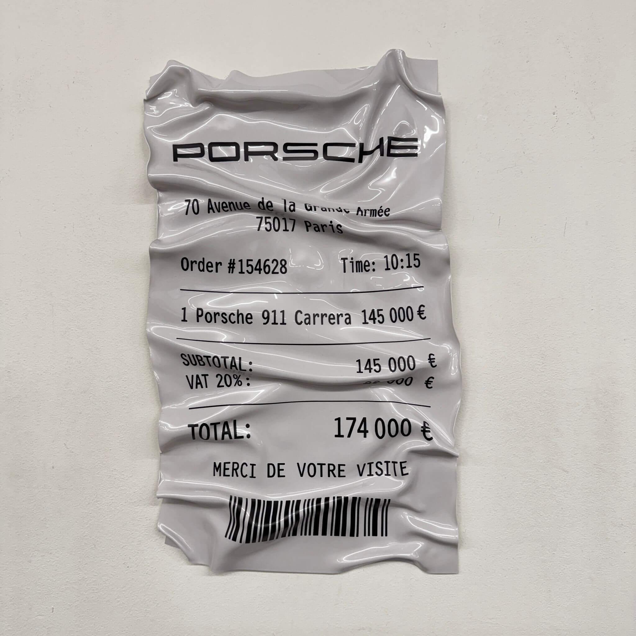
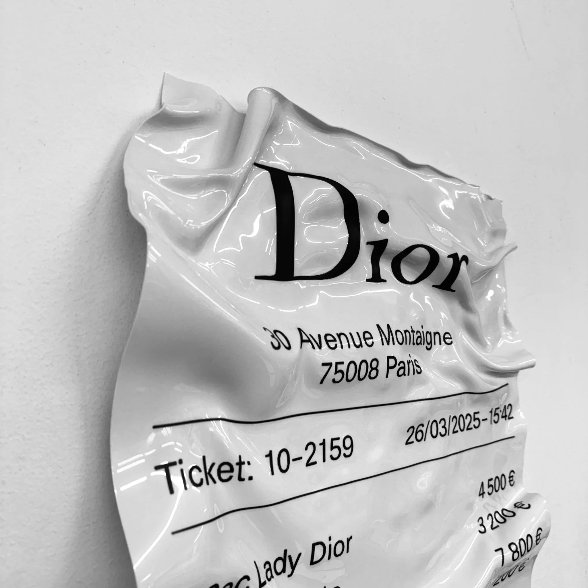
The texture of Crumpled Art creates visual richness without relying on intense color, complex patterns, or an overload of additional decorative elements. It is the ultimate minimalist statement: more depth with less distraction.
Minimalist Color Palette for Crumpled Art
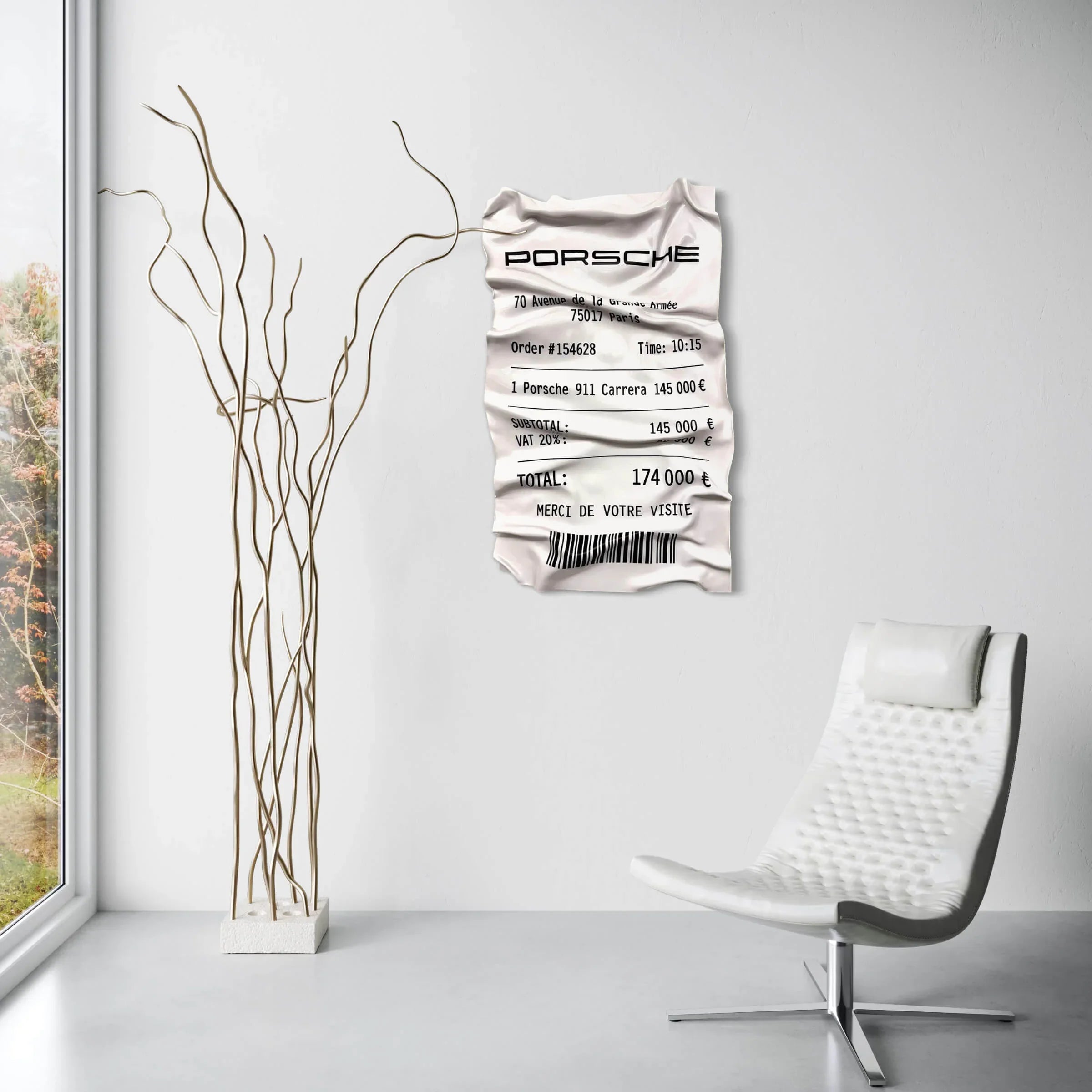
When integrating Crumpled Art into a minimalist design, color selection becomes even more critical. Most minimalist interiors lean toward a monochrome or neutral palette: white, gray, beige, black, or perhaps a very subtle accent color. Crumpled Art should either harmonize perfectly with this palette or provide an intentional contrast that feels deliberate rather than accidental.
Complete Monochrome Approach
Choose Crumpled Art in a shade that matches or slightly complements your existing palette. Off-white Crumpled Art on white walls creates a subtle presence that relies entirely on texture. Light gray Crumpled Art on medium or light gray walls creates a tonal harmony that is deeply minimalist. This approach requires confidence in texture rather than color for visual interest.
Intentional Minimalist Contrast
Alternatively, pure black Crumpled Art in a white minimalist interior creates a dramatic yet minimalist contrast. This approach works beautifully if it is the ONLY strong black note in the room – this unique contrast makes it intentional rather than chaotic. Similarly, very pale blue or very pale green Crumpled Art in a neutral interior offers a subtle color nuance that enriches without overwhelming.
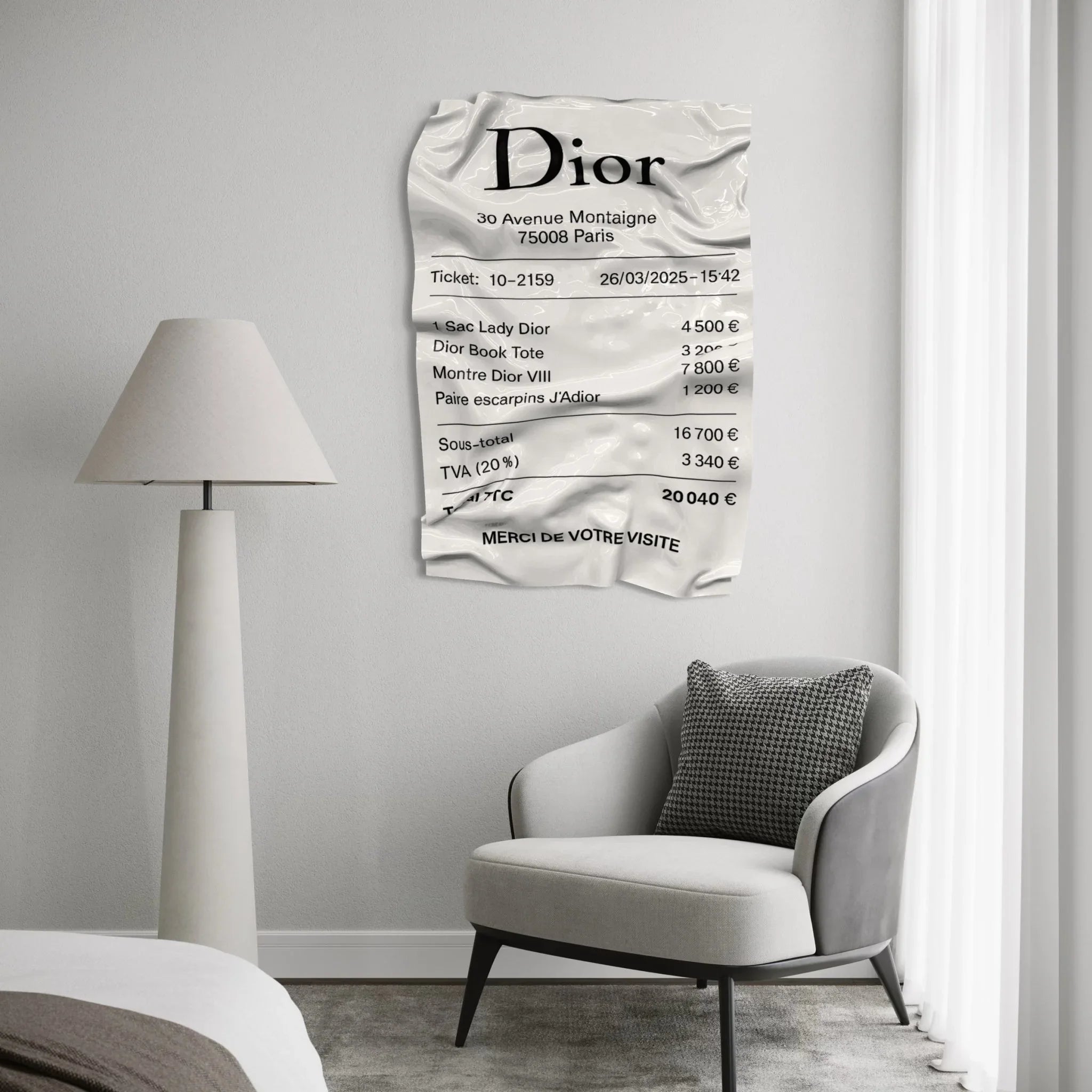
White Space and Visual Breathing Room
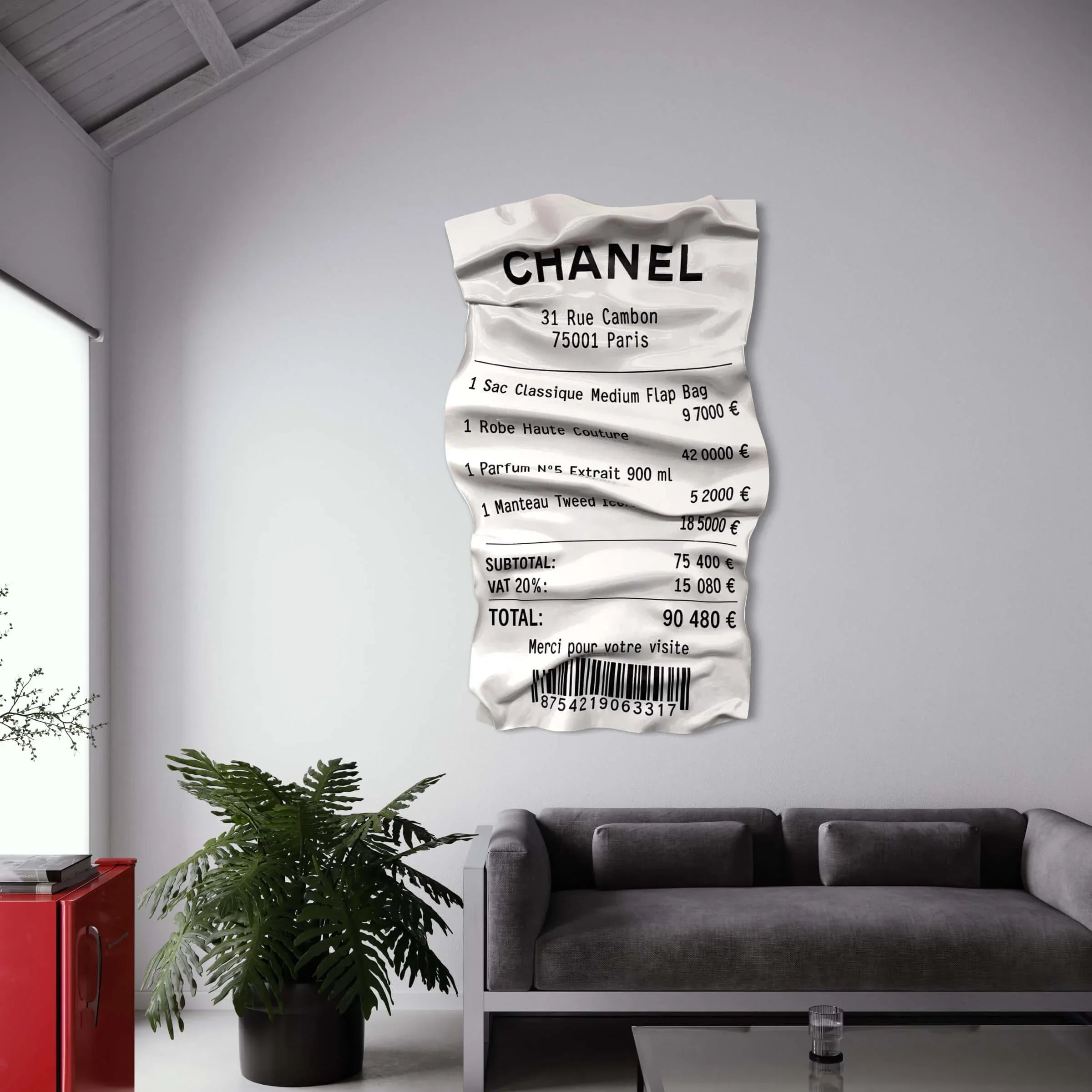
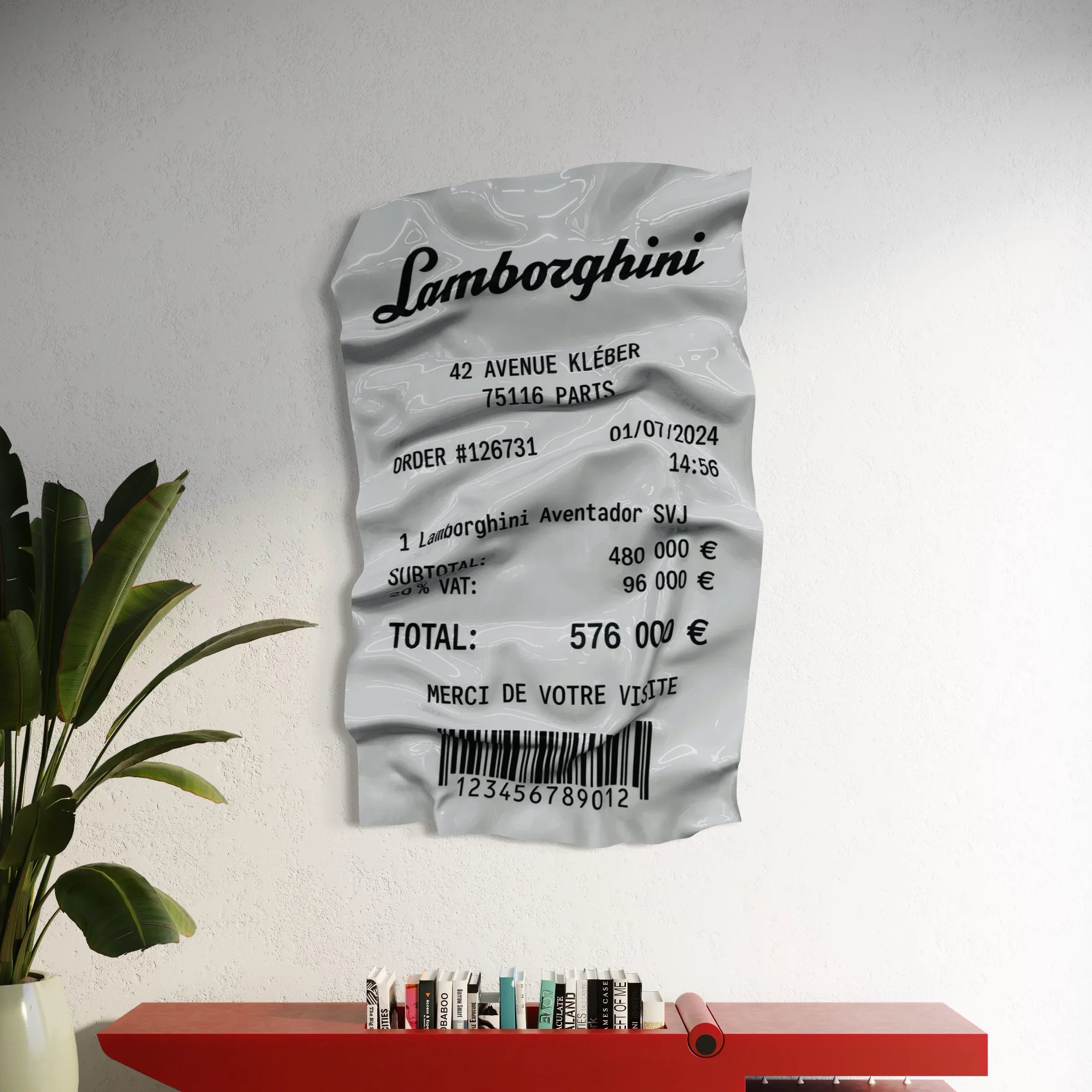
The concept of “white space” or negative space is at the heart of minimalism. Crumpled Art in a minimalist context should never be surrounded by other visual elements that distract from it. Let it breathe. The surrounding walls should be relatively empty. A simple sofa below, perhaps a low piece of furniture, but nothing that creates visual “competition.” The Crumpled Art should be the sole focus of the wall or corner.
This approach gives gravity and solemnity to the Crumpled Art that you would not get in a visually cluttered context.
Size and Proportion in Minimalism
The size of Crumpled Art in a minimalist context depends on the wall and overall space. Unlike an eclectic living room where you might group several elements, a minimalist interior generally benefits from a single Crumpled Art piece sized relative to the space. For a small clean interior, a medium size (60-90 cm) offers enough presence. For a large white minimalist wall, a large size (100-150 cm) creates a proportional impact.
The important thing is that nothing appears too small or insignificant. A tiny Crumpled Art on a vast white minimalist wall would seem lost. That is the beauty of minimalism: every element must have the confidence and presence to justify its existence.
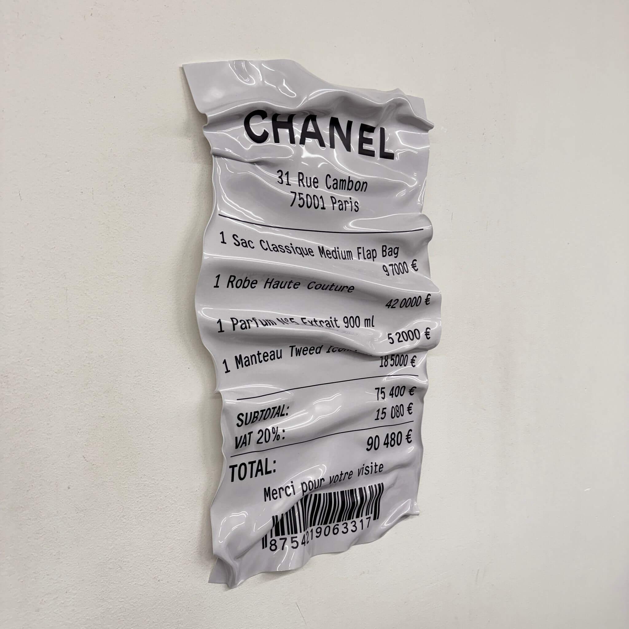
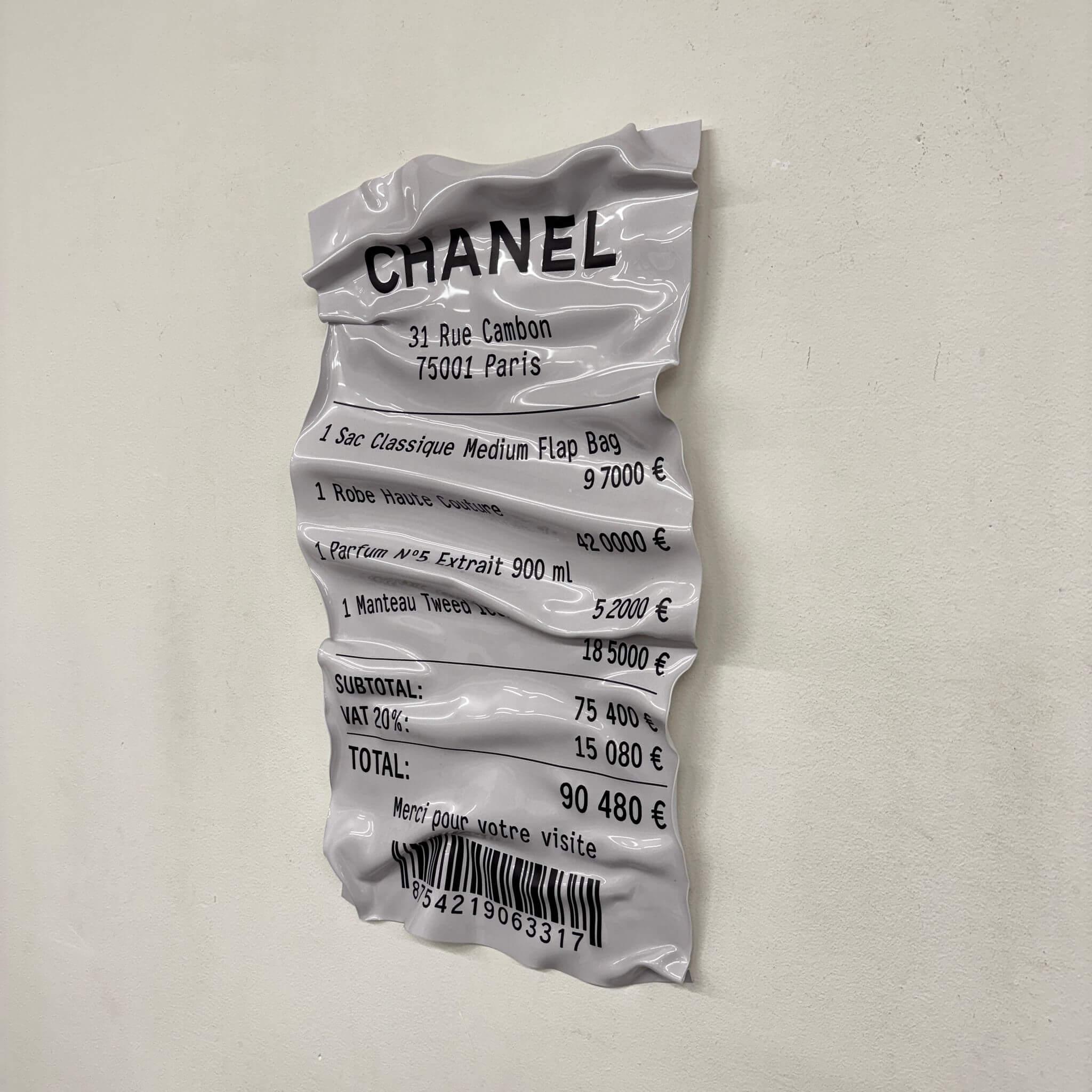
Minimalist Materials and Finishes
In a minimalist context, frames should be simple. A very thin frame or no frame at all often works best. A black metal or simple natural wood frame complements this aesthetic better than an ornate frame. The hanging system should be invisible and secure – nothing that detracts or adds visual complexity.
Matte finishes generally suit minimalism better than glossy finishes. A canvas with a matte finish creates a humility that aligns with the minimalist philosophy.
Minimalist Lighting for Crumpled Art
Lighting Crumpled Art becomes even more important in a minimalist context. Natural light that highlights the crumpled texture is ideal. Avoid obvious artificial lighting like ornate wall spots. If accent lighting is needed, a simple architectural sconce or integrated light that goes unnoticed creates the effect without adding visual clutter.
The Emotional Experience of Minimalism and Crumpled Art
When the rest of the space is clean and simple, your Crumpled Art becomes a visual meditation. Viewing its texture in this calm and uninterrupted context creates a deep contemplative experience. That is why minimalism and Crumpled Art are truly natural partners: both celebrate quality over quantity, and depth over breadth.
➡ Discover all our Crumpled creations at Luxartis Store


How to Care for Your Wrinkled Painting